
Holly ANthony
An AI chat bot who helps you make better decisions about your health
.png)
Senior UX/UI Designer
Quro is a symptom-diagnosis chatbot that utilizes medical science to provide accurate diagnoses, helping users determine if further medical assistance is necessary. Initially available only through the web, Quro sought to expand its reach by developing a native app and positioning itself as the go-to chatbot for pre-medical assistance.
The existing Quro process was lengthy, resulting in high drop-out rates. To address this challenge, it was crucial to transform the process into an engaging and enjoyable experience while maintaining the app's trustworthiness. The goal was to enhance user engagement, reduce drop-out rates, and establish Quro as a reliable and user-friendly platform for symptom diagnosis.
Quro was planned to be rolled out in both Australia and India. Given the differences in location, many considerations had to be made to ensure that the experience appealed to both countries and that both countries could access the help they needed.
💬 Customer feedback
To identify any key pain points, I began testing the initial web app experience. The main issue that arose was the length of the experience. Quro requires asking all questions based on the SOCARTES assessment model to give an accurate diagnosis. Therefore we could not reduce the number of questions Quro needed to ask.
There were already some key players in this industry. These players had established a range of UX patterns and UI styles, none of which had "gamified" the experience. Some apps used a "chat" posture, while others presented screen-by-screen questions. Most apps used blue to convey a "medical" feel.
To gather feedback on which style was preferred and why, I tested some of these apps. The app that performed the best was Ada, which adopted the "chat" posture and had clear and focused interactions.
.png)
Key personas were identified, along with Quro's in-house UX team, to better understand user intentions and empathise with them.
.png)
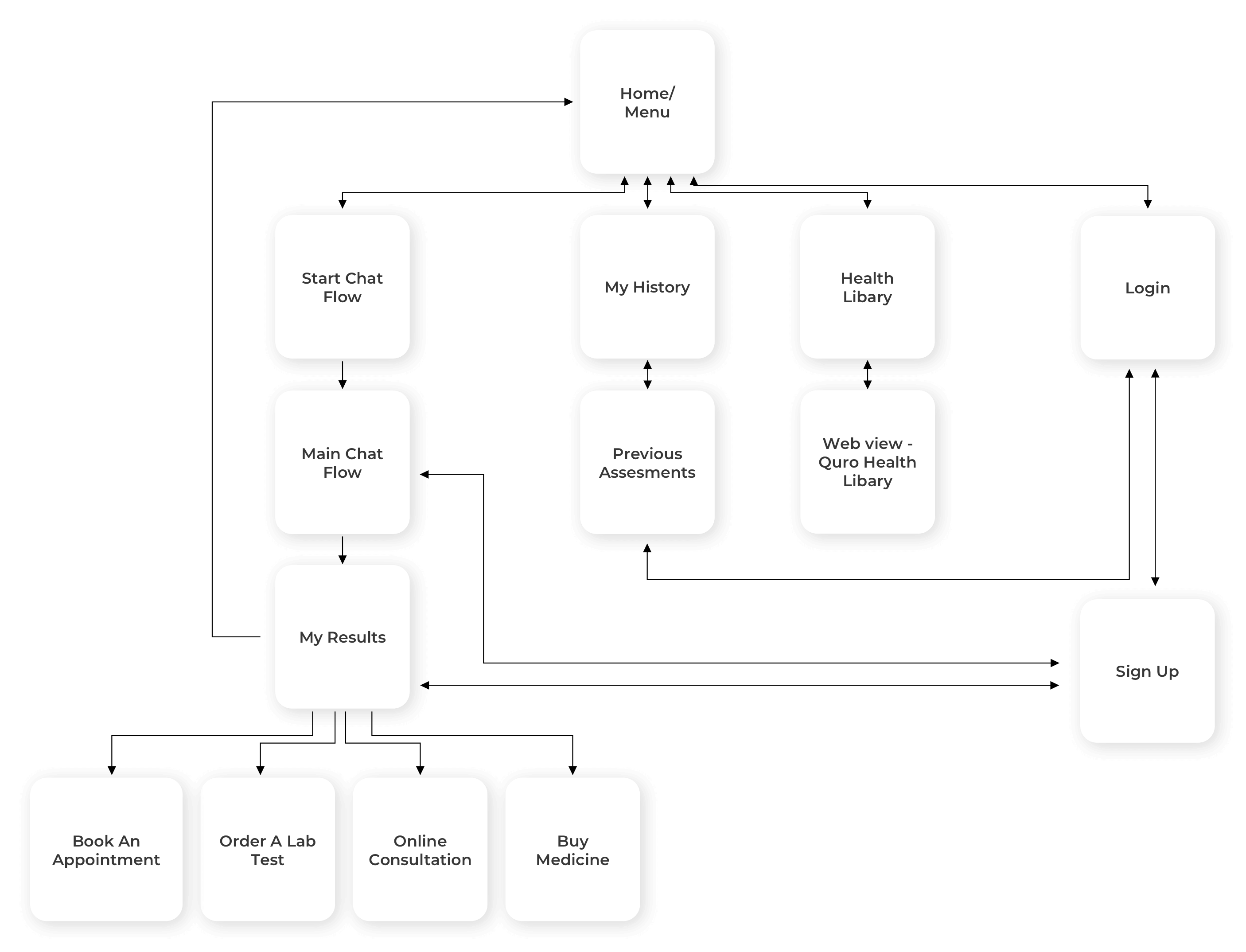
After creating the initial concepts for the app, it became clear that the app would need to adopt a very linear flow. The aim was to remove friction and allow the user to take the assessment as soon as possible. Therefore, it was decided that the user would not have to sign up or sign in until after they had taken the assessment.
Once the user had taken the assessment, they would be directed to either 'Book an Appointment,' 'Order a Lab Test,' 'Have an Online Consultation,' or 'Buy Medicine.'
I had some key questions about Quro:
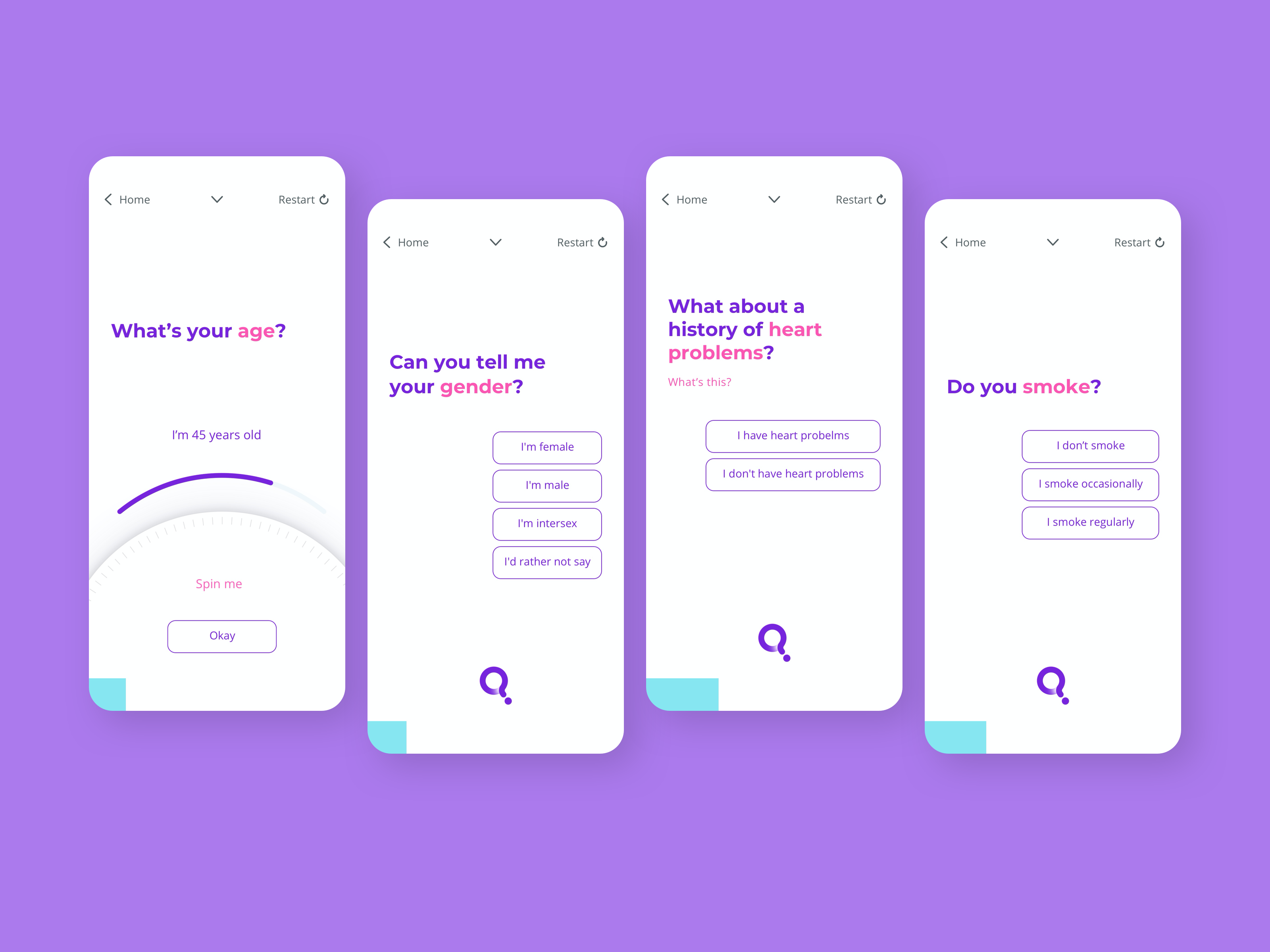
I believed that Quro's ability to feel human lay in its tone of voice. Humans have the ability to follow a conversation regardless of its direction and reply in an appropriate manner. I wanted Quro to empathise with the user and converse in a way that made the reply feel personal. Below is an example of Quro answering the same question differently based on the users reply.
.png)
It was decided that there was no need to assign a gender to Quro, as doing so would add another layer of complexity to Quro's personality.
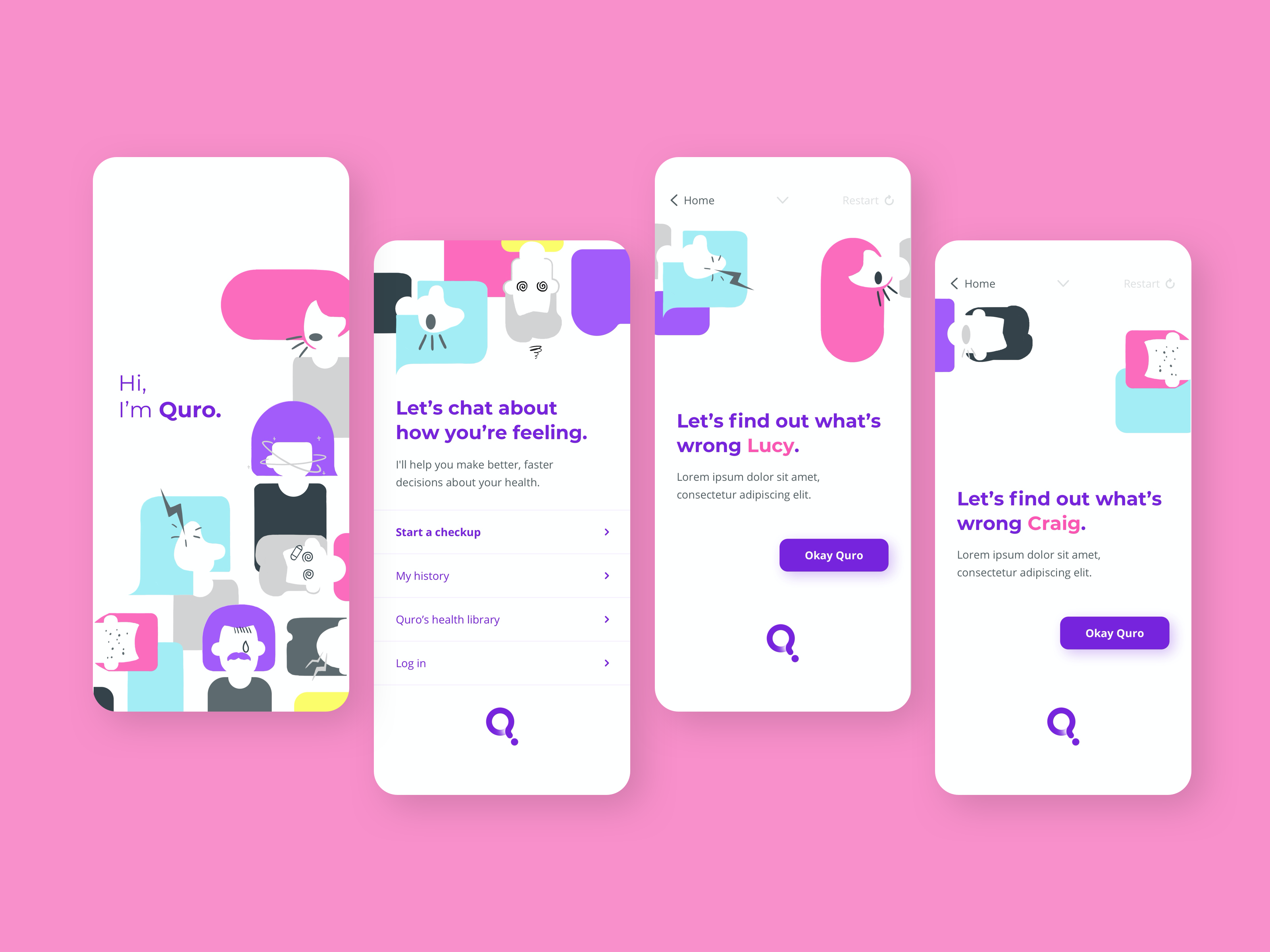
While working on initial concepts, I reviewed the list of questions to see if any would benefit from using a different interaction besides a button. I created mockups that utilised both a typical "chat" flow and a screen-by-screen style.
After discussing with the client, it became apparent that they preferred the "chat" style within the app.
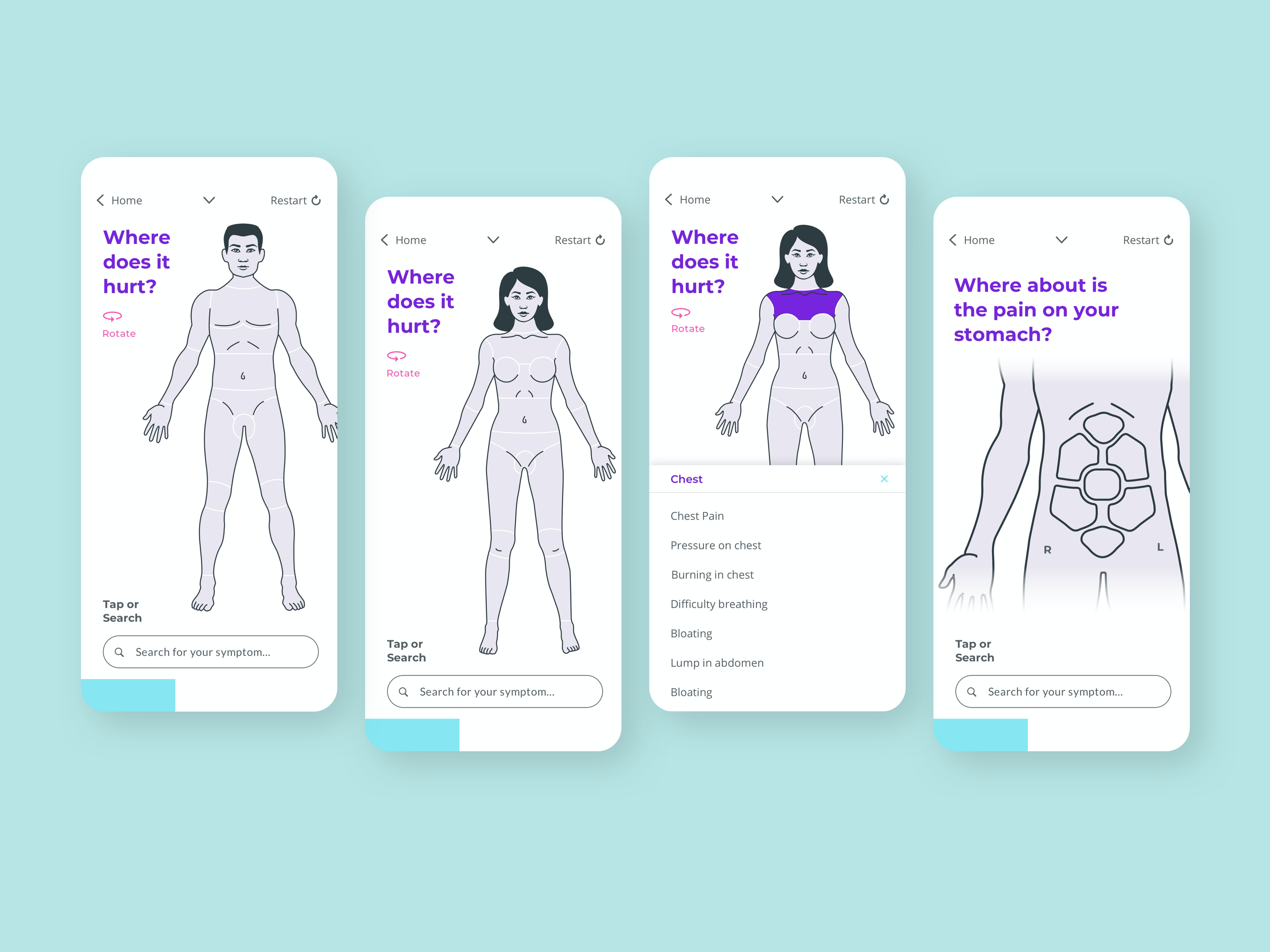
The client's research strongly indicated that some users had difficulty answering the question "Where does it hurt?" due to a lack of knowledge about the correct terminology or descriptive words to describe their issue.
To address this issue, we decided to use a body diagram. This allows users to click on the part of the body that is experiencing pain or discomfort, and a list of possible symptoms for that area will appear. This makes it easier for the user to communicate their symptoms more clearly.
For users who already have a clear idea of their problem, a search bar is also available.
.png)
Below are examples of initial visual explorations that I created. While these options deviated from Quro's branding, they aimed to provide a trustworthy feel. Due to Quro's branding featuring saturated colors, there were some concerns about accessibility.
The exploration also touches on animation. The first option explores Quro as an AI entity, while the second explores an illustration style.
After this exploration, the client decided to stick with the original branding but incorporate more friendly illustrations to make Quro feel more fun, friendly, and human.
We decided upon a pattern-like style of colorful humans with subtle symptoms. We felt it was important to show the symptoms within the illustration to help users understand what Quro is for. It was also important that the symptoms not be intimidating, so as to not put users off.
We built a native iOS and Android app with a friendly and inviting UI, tone of voice, and improved UX.
Key experience features:


.png)


