.png)
Client
Website
The Business Context
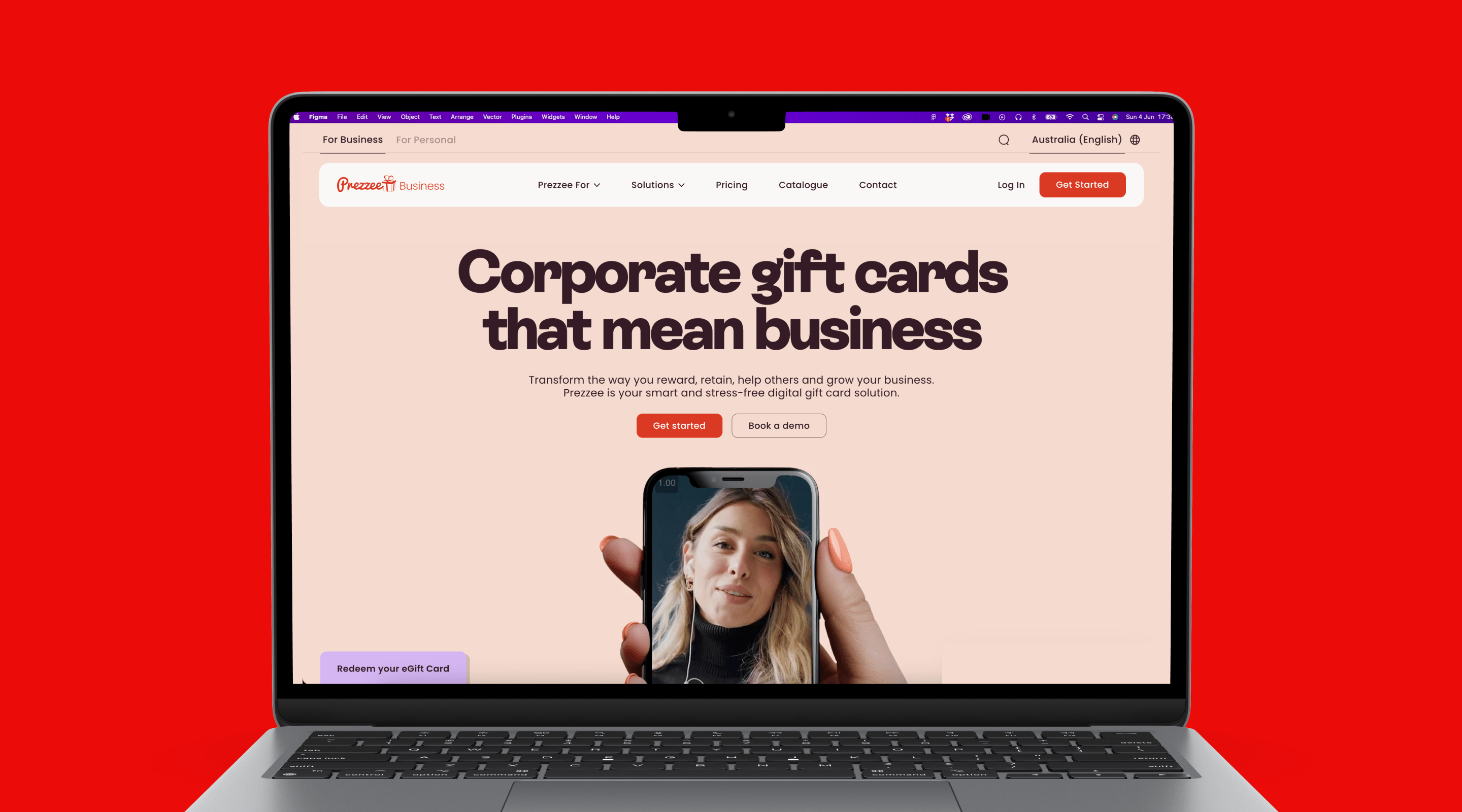
The Prezzee Business website hadn't been properly updated in over five years. It looked like a startup, not a global platform processing millions in transactions.
Sales teams were losing deals because prospects couldn't understand our offering clearly. The site didn't communicate the value we delivered to clients or reflect the strength of our product.
B2B buyers questioned our legitimacy and stability. In markets like the US where we were growing fast, we were essentially invisible online despite triple-digit revenue growth.
The Challenge
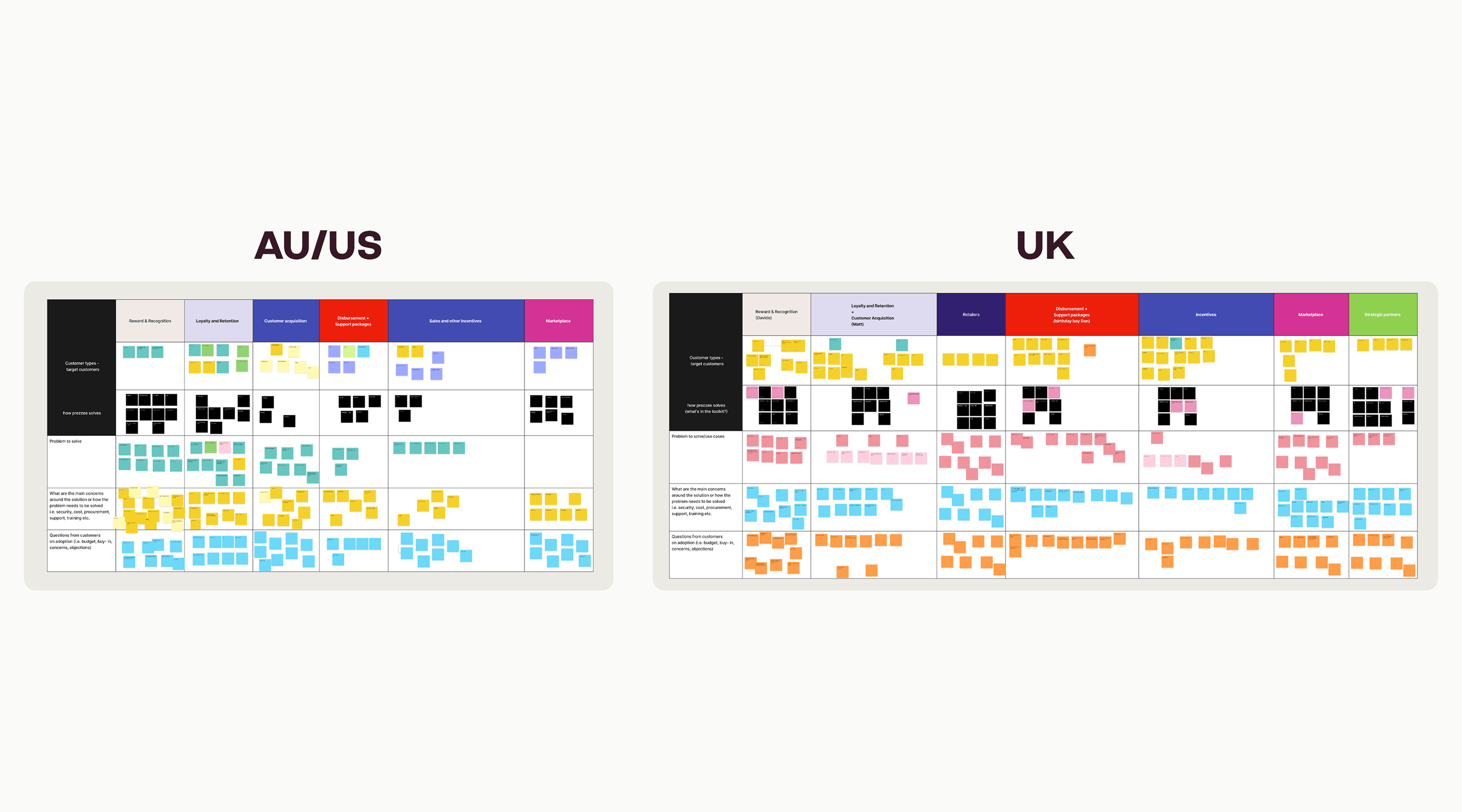
The project involved multiple stakeholders across Sales teams in Australia, the UK and the US. Each market had different priorities and customer needs to balance.
The first creative presentation to the CEO and Chairman didn't land. Their feedback was direct: it's cool, but it lacks emotion. It doesn't communicate our vision or human connection.
We also had a tight timeline of four to five months to deliver a complete redesign and rebuild.
And critically, this needed to push the brand forward without being a full rebrand. We had to modernise the visual identity while maintaining continuity with the broader Prezzee brand.
The Approach
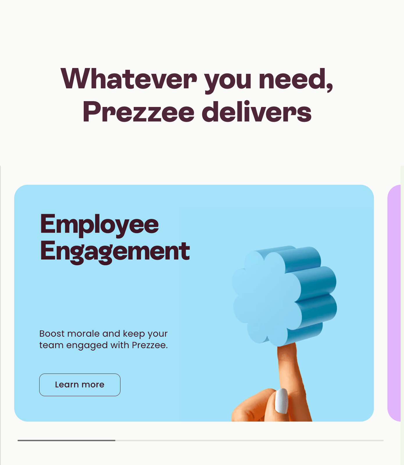
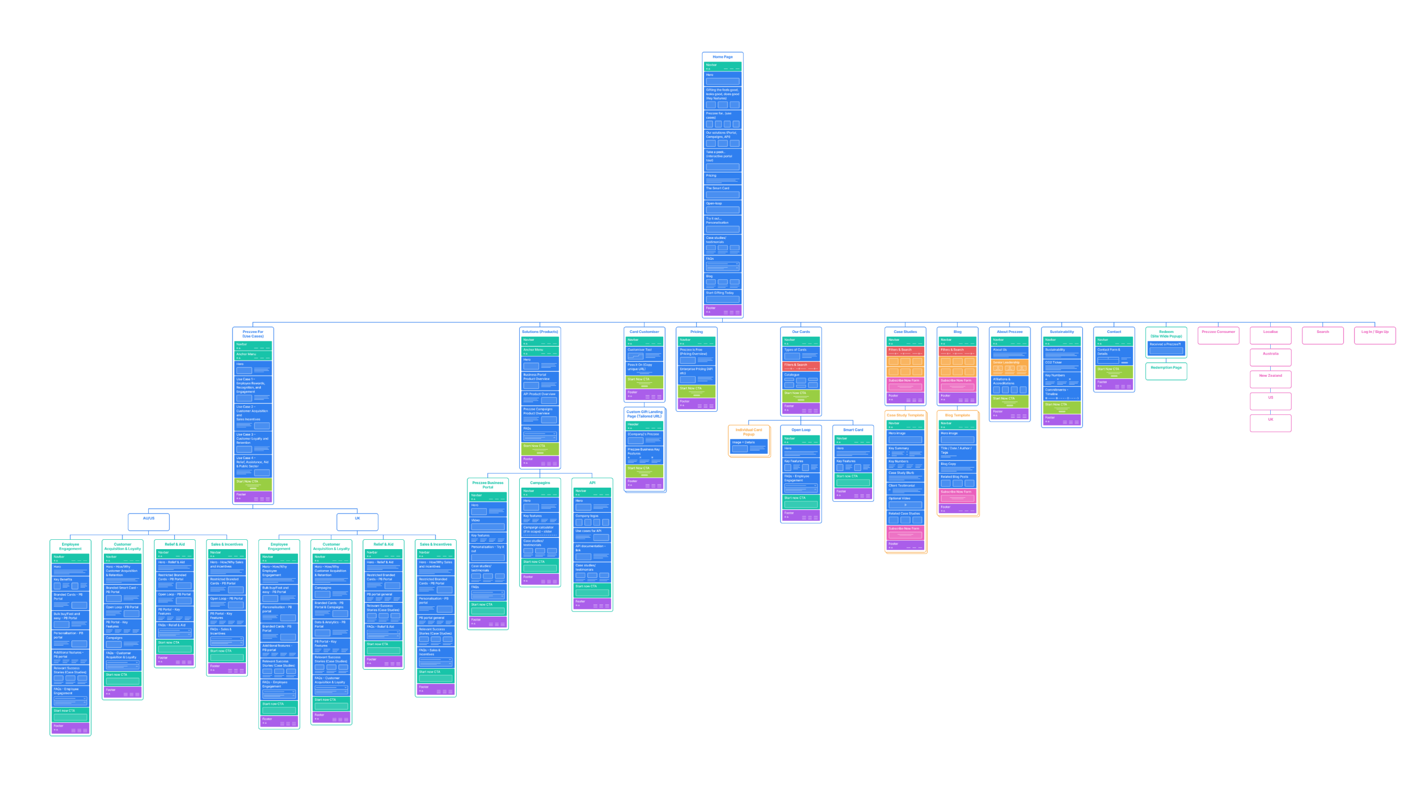
I started with sales workshops to understand the different customer groups and map them to clear use cases. This informed the site structure and ensured we were solving real sales problems, not just making things look better.
For the agency partnership, I selected a partner with strong brand thinking over pure technical capability. The site needed to feel cohesive and emotionally resonant, not just functional.
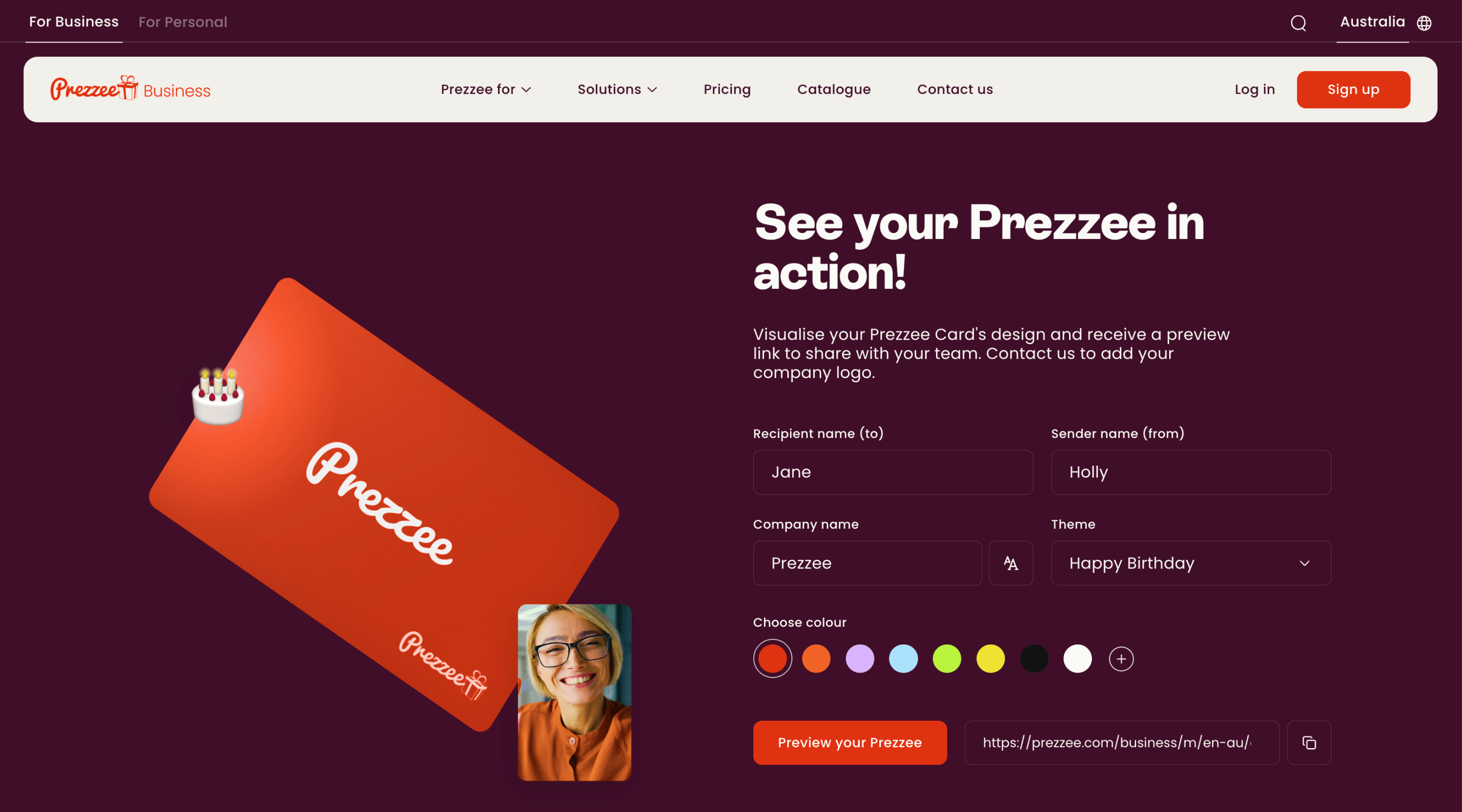
We made a strategic brand decision to return to Prezzee's signature red. Previous versions of the site had used purple to differentiate B2B from B2C, but competitive research showed our red was more distinctive. Rather than separate the B2B brand, we reconnected it to the master brand's strength.
After the initial presentation was rejected, I personally directed the creative refinement. I worked with the agency to make the work feel more human and emotionally resonant, then presented the revised approach with full strategic rationale for every design decision.
The second presentation received a standing ovation from the Chairman.
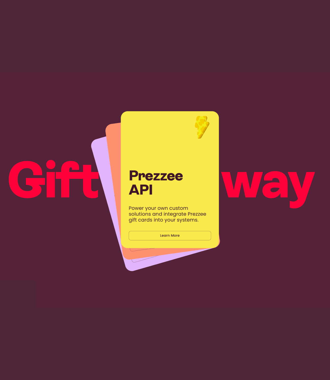
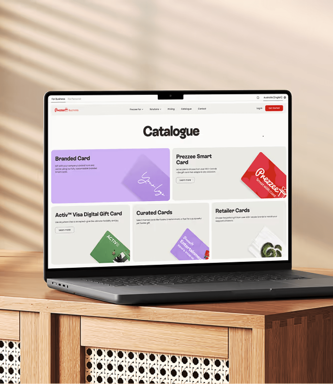
We implemented dual navigation to serve both product-focused and use case-focused buyers. We refined messaging, introduced more detailed and relevant content and modernised the visual and written identity that elevated our global brand presence.
The Impact
Site usability improved dramatically
Users struggling to find the information they needed on the site dropped from 60% to 30%.
Lead generation increased
We saw growth in both contact sales submissions and sign-up forms.
Sales alignment strengthened
Feedback from the sales teams was overwhelmingly positive. One comment stood out: "I've never felt so involved in a marketing project."
Brand cohesion improved
We created a unified B2B and B2C presence that maintained distinct purposes while feeling like the same company. The red reconnected B2B to the master brand's emotional strength.
Global credibility lifted
We no longer looked like a startup. The site communicated stability, scale and strategic thinking that matched our actual business capability.
What This Unlocked
This project became the foundation for everything that followed.
The visual identity, tone and strategic clarity we established here informed the brand guidelines and the broader brand platform evolution.
It also became a proof point for the Webflow migration. Seeing what was possible with modern tooling and thoughtful design made the business case for moving the rest of our marketing stack.
Most importantly, it solved the immediate commercial problem. Sales teams had a site that helped them close deals rather than creating doubt. Prospects could understand what we did and why it mattered.
Leadership Reflection
Bringing people on the journey was critical to this project's success. The sales team and CEO are deeply connected to our Business product, it's close to their hearts and they understand our customers inside out. Their input made the work stronger and more grounded in commercial reality.
We also knew that without genuine stakeholder engagement throughout the process, the site wouldn't have received the internal support and adoption it needed to succeed. Getting buy-in early meant the business championed the work rather than questioned it.
The outcome speaks for itself. Sales teams are closing more deals with a site that actually helps them sell and the CEO is genuinely proud of what we've built and how it represents our offering in market.